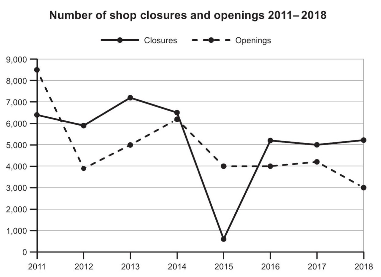
The given line chart illustrates how many shops closed and opened in a certain nation from 2011 to 2018.
Overall, the number of both shop openings and closures experienced upswings, and at the end of the period, the figure for closures was higher than that for openings.
Regarding the first 3-year period, the number of shop openings plummeted by more than a half to around 4000 in 2012 before witnessing a surge to over 6000 new shops in 2014. Meanwhile, there was the extremely marginal increase to roughly 6500 shop closures despite some fluctuations. In terms of the next 4-year time, the year 2015 recorded the plunge to approximately 500 shop that closed, in comparison with the milder dip to 4000 shop openings.
In the last three years, the statistics on closures soared back to nearly 5100 in 2016 and remained almost unchanged by 2018. In contrast, the number of shop openings experienced a stability until 2017 in which the data shrunk to 3000.